Case study — Mable
Redesigning the work order form that was quietly costing maintenance workers hours they didn't have
A field-heavy system used across 3,300 housing authorities and 1.2 million households, where small friction in one form compounded into real delays out in the field.
7 min read
Context
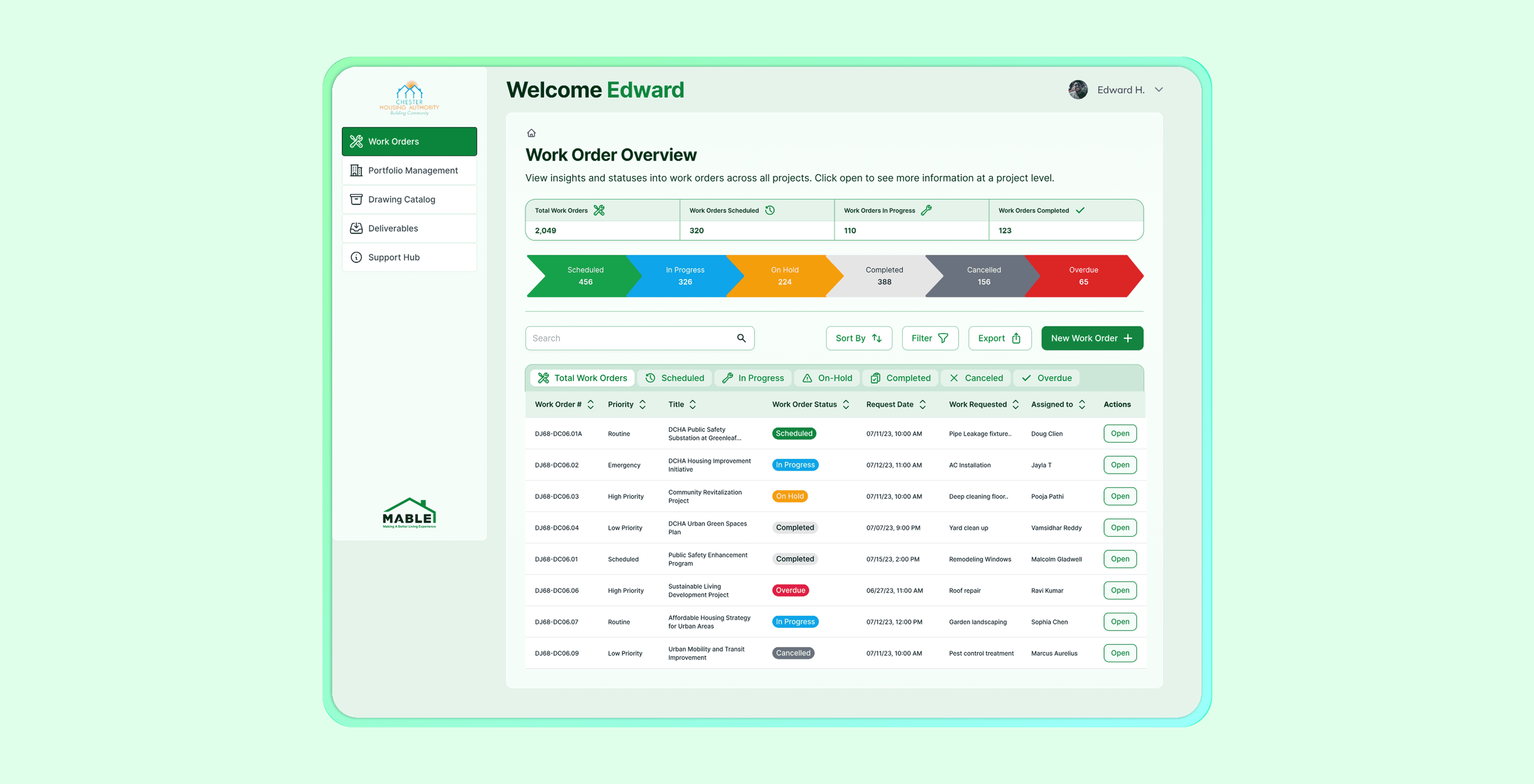
Mable builds property management software with one job: make living somewhere simpler
Behind that mission is real infrastructure: 3,300 housing authorities across the U.S. rely on Mable to manage housing stability for 1.2 million households.

But first: how are work orders assigned?
Here's how it's supposed to work: a housing authority assigns a work order. A maintenance worker goes out, fixes the issue, and logs what happened. The authority tracks status and closes it out. Simple, in theory. But what actually happened once a worker opened the form on-site told a different story.
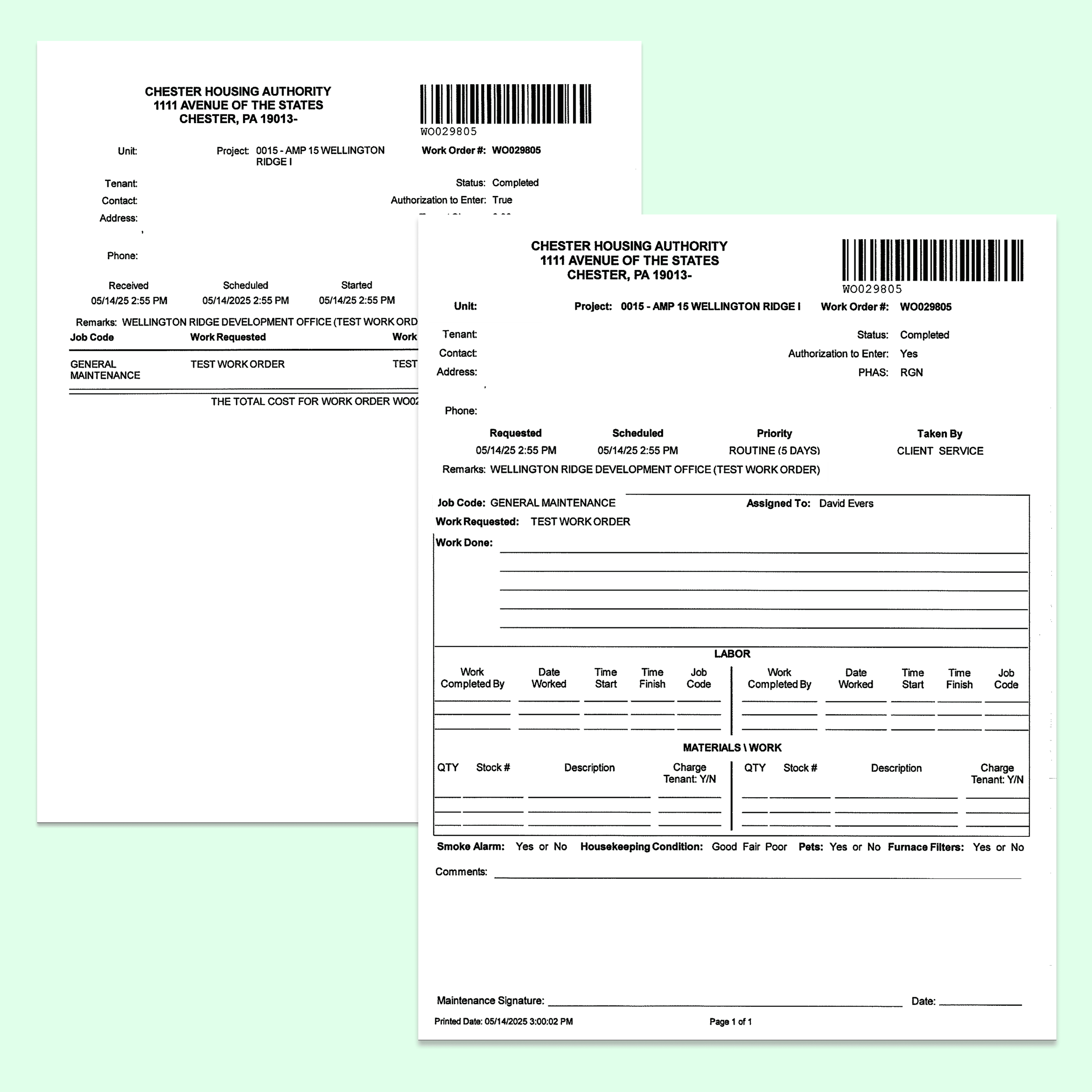
The push came directly from the client: work orders were still logged on paper, and they wanted the process fully digital, captured in the field instead of re-entered back at the office.
The Problem
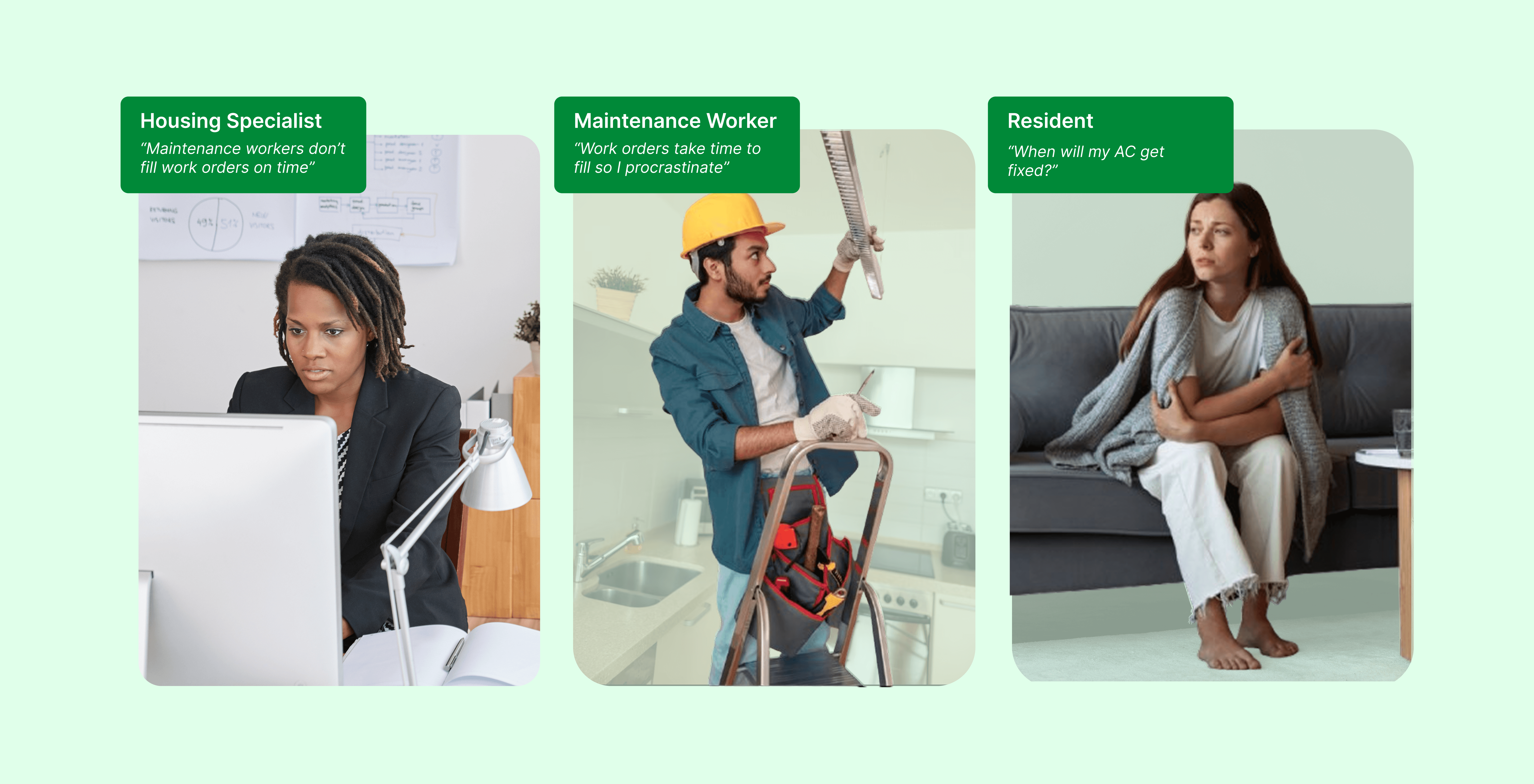
Watching workers fill this out mid-repair, not in a conference room
Before redesigning anything, I proposed we go into the field rather than rely on the existing form audit alone. A supposedly simple form was costing workers hours every week, and I wanted to see why firsthand.
Contextual Inquiry
5 maintenance workers, live work orders.
Existing Form Audit
Every field, every screen.
Competitor Walkthroughs
How competitor housing platforms handled the same flow.
Semi-Structured Interviews
With housing authority staff.
Engineering Workshop
Mapped which fields were genuinely required.
The Data
Only 1 of the 5 workers I tested could tell which fields were required
In task-based testing with the same 5 workers, I asked each to complete a standard work order with no guidance on which fields were required.
Given the two-week sprint, I focused on identifying consistent behavioral patterns rather than statistical significance.
6.5 min
Average completion time
per work order, across 8–12 orders/day per worker
1 of 5
Workers knew required fields
correctly identified them before submitting
15–20
Duplicate entries every day
same core details re-entered per worker
From staff interviews
Housing authority staff had no way to see a work order's status without contacting the worker directly.
The Pattern
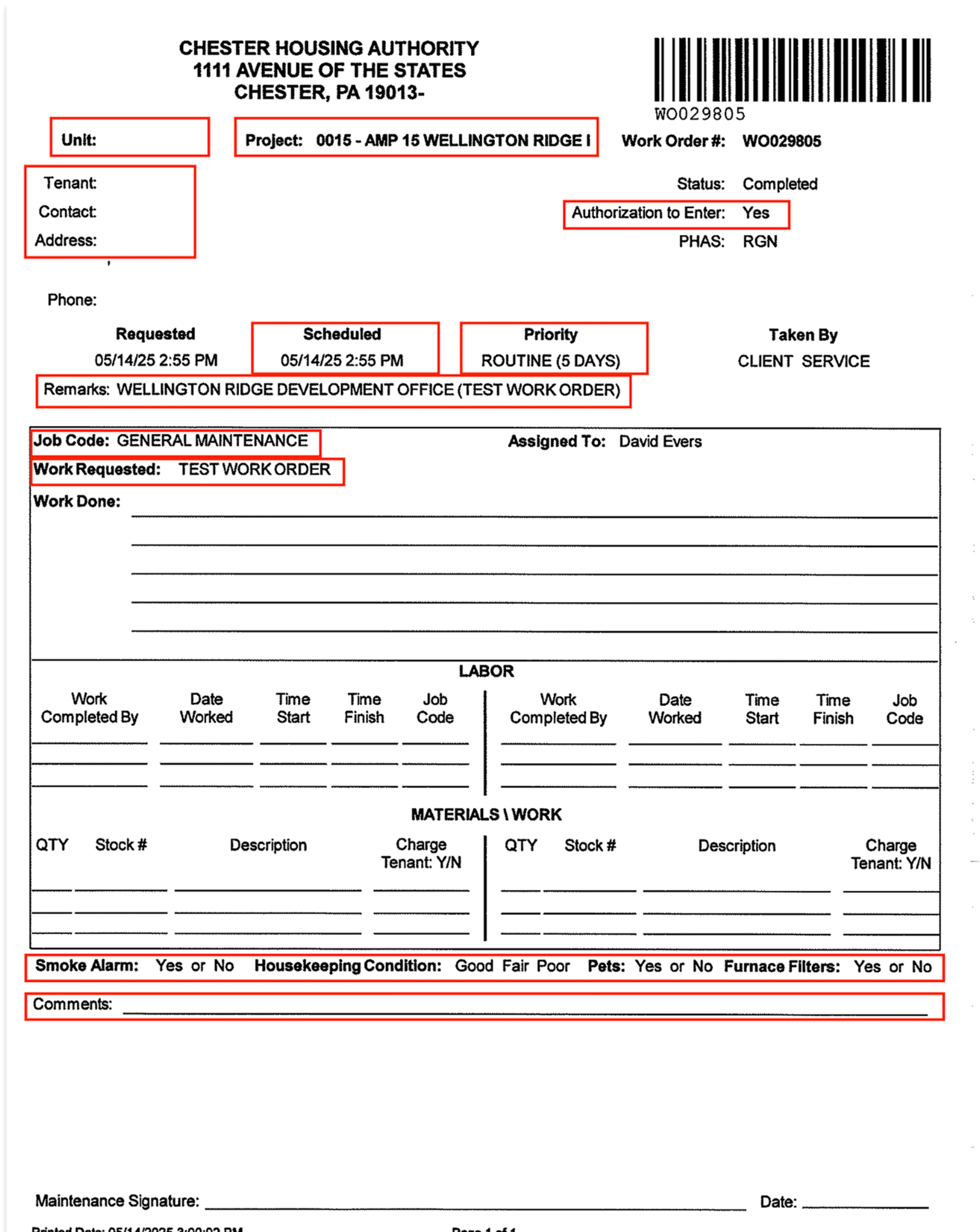
The form treated every field like it mattered equally
01
One long, flat sequence
All fields were presented in a single unbroken run with no logical grouping by task stage: screen after screen of equal-weight inputs.
02
The form asked for what the system already knew
Data already available in the system, like worker ID and unit info, still had to be typed in manually on every single order.
03
A compounding tax, not one bad form
The cost wasn't a single frustrating experience. It compounded across every order, week after week.
The Insight
This was a decision-load problem, not a speed problem
Root cause
The form was structured around what the backend needed to store, not around the order a worker naturally thinks through a repair.
What that caused
Every unlabeled or ambiguous field forced a worker to stop and guess.
What it cost
Multiplied across 8–12 orders a day, those pauses added up to the hours the data had already surfaced.
Design Opportunity
How might we reduce the number of decisions a worker has to make on any given screen, so completing a work order feels like a natural next step rather than a search for the right field?
Here's the direction I proposed after synthesis:
Break the form into progressive, multi-step disclosure — surfacing only the next decision a worker needs to make, not all of them at once.
This work was constrained by a legacy backend system, a two-engineer implementation team, and a two-week release window. Those constraints shaped what could realistically be redesigned versus removed.
I ran affinity mapping across the research notes to pressure-test the direction, grouping observations to see whether the pattern held across every worker I'd watched instead of only the loudest interview.
Considered
A lighter fix: simply mark which fields were required.
Why I rejected it
It would have solved the labeling confusion but left the real problem untouched. Workers would still face every field and every choice at once.
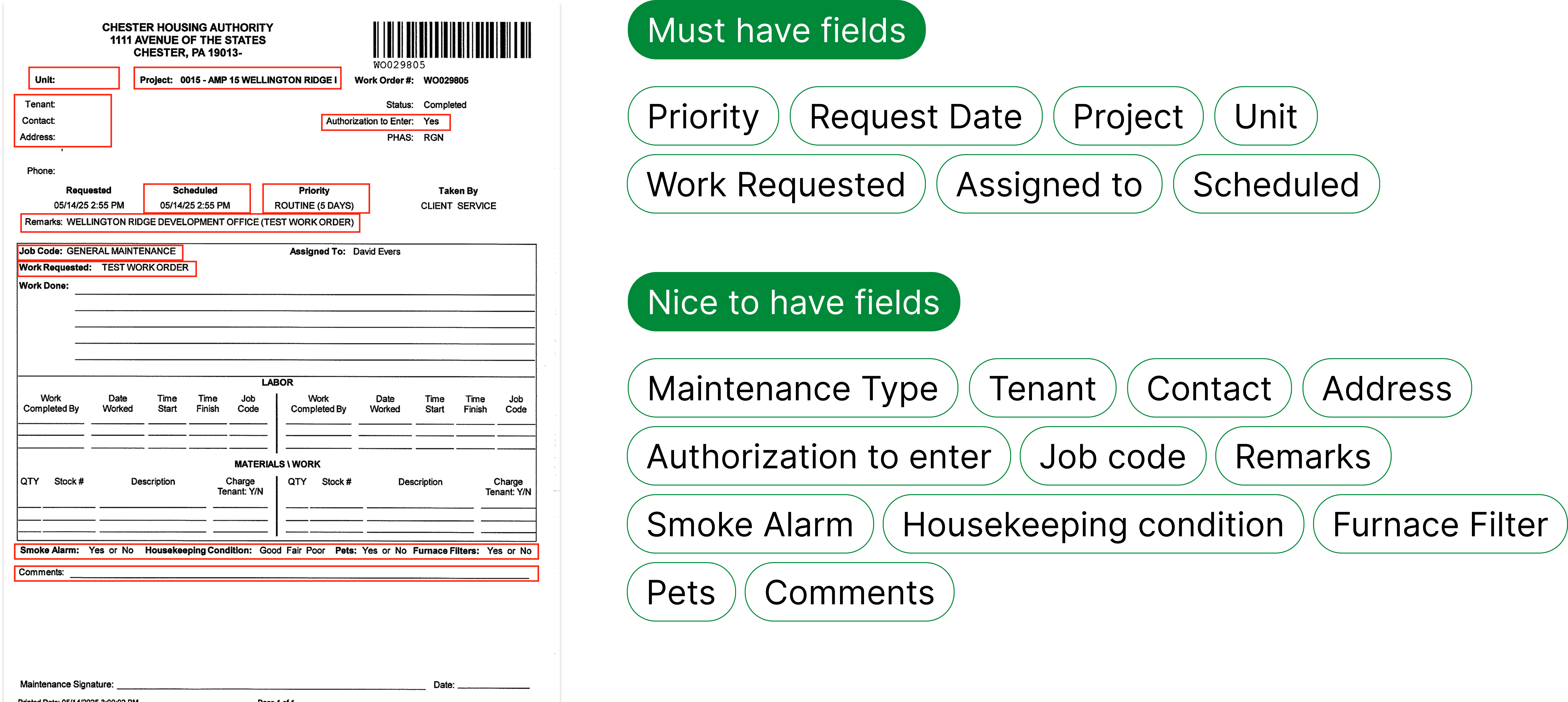
Affinity mapping across all five workers. The pattern held across the group.
High-level audit helped in breaking down the form into multiple steps
The audit made the fix concrete. The real friction was the missing hierarchy between required and optional inputs, not field count. That's the same gap the earlier data had already pointed to.
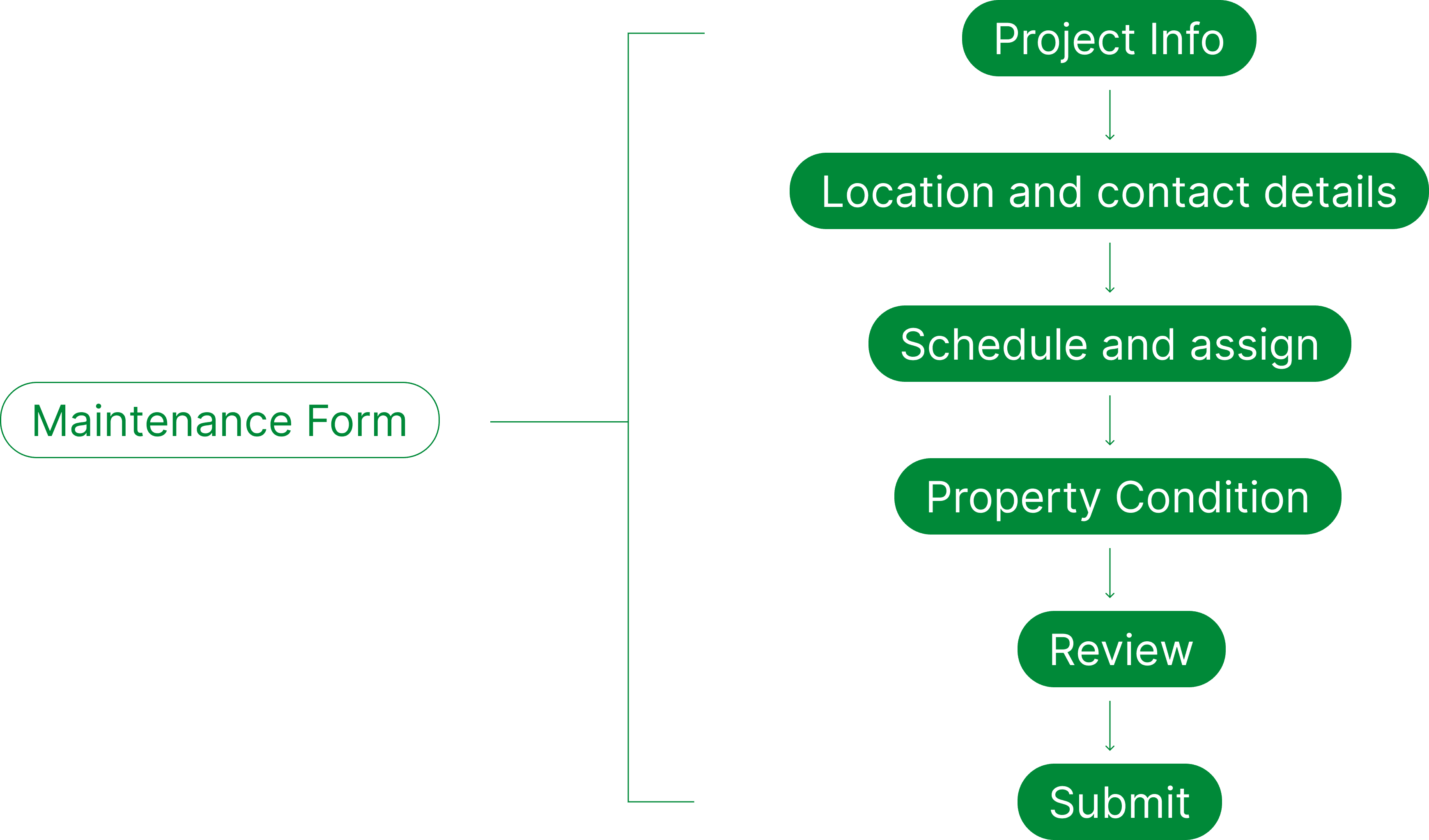
Exploring progressive disclosure to limit user decisions
Working with engineering, I mapped which fields could be auto-populated from data the system already had versus what genuinely needed a human to type it. Worker ID and unit info could be pulled from the system automatically, while the issue description still needed the worker's own words.
That distinction is what let the field count drop by nearly a third. The fields weren't hidden. They were removed because they never needed a human in the loop.
5
Workers interviewed & tested
same group across contextual inquiry and usability testing
32 → 22
Fields per work order
placeholder, confirm exact before/after count
1 → 4
Steps to complete a form
placeholder, confirm exact step breakdown
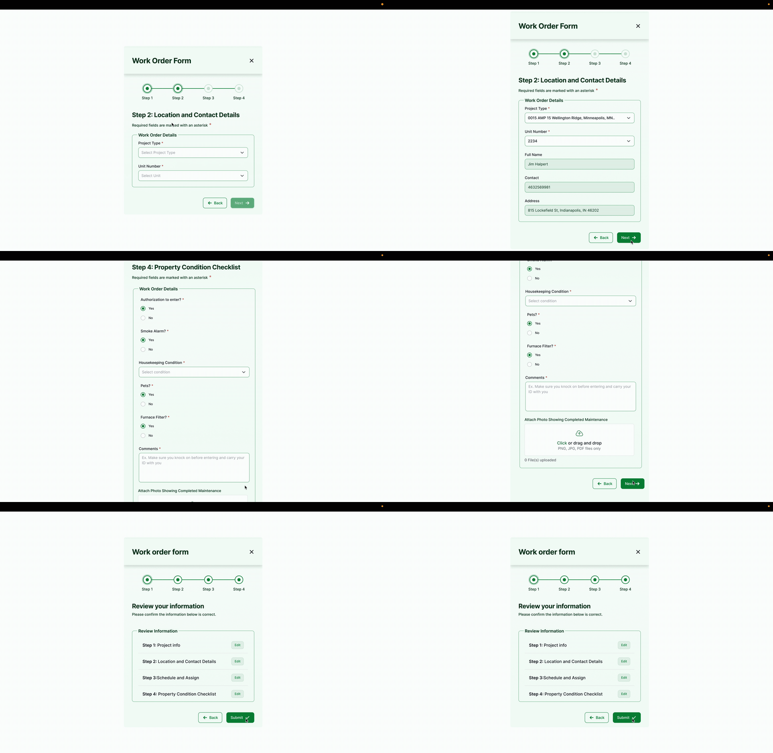
The work order flow, brought into the web portal.
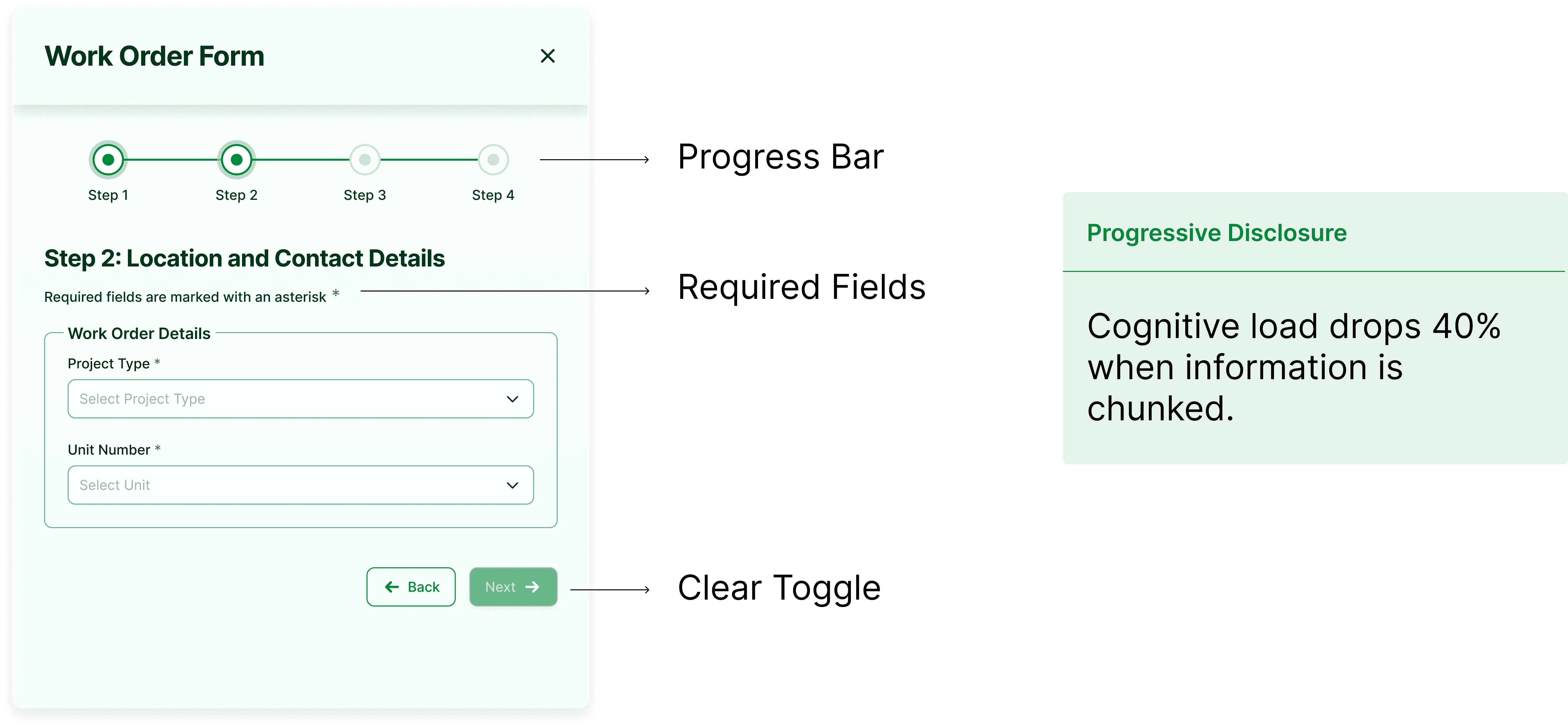
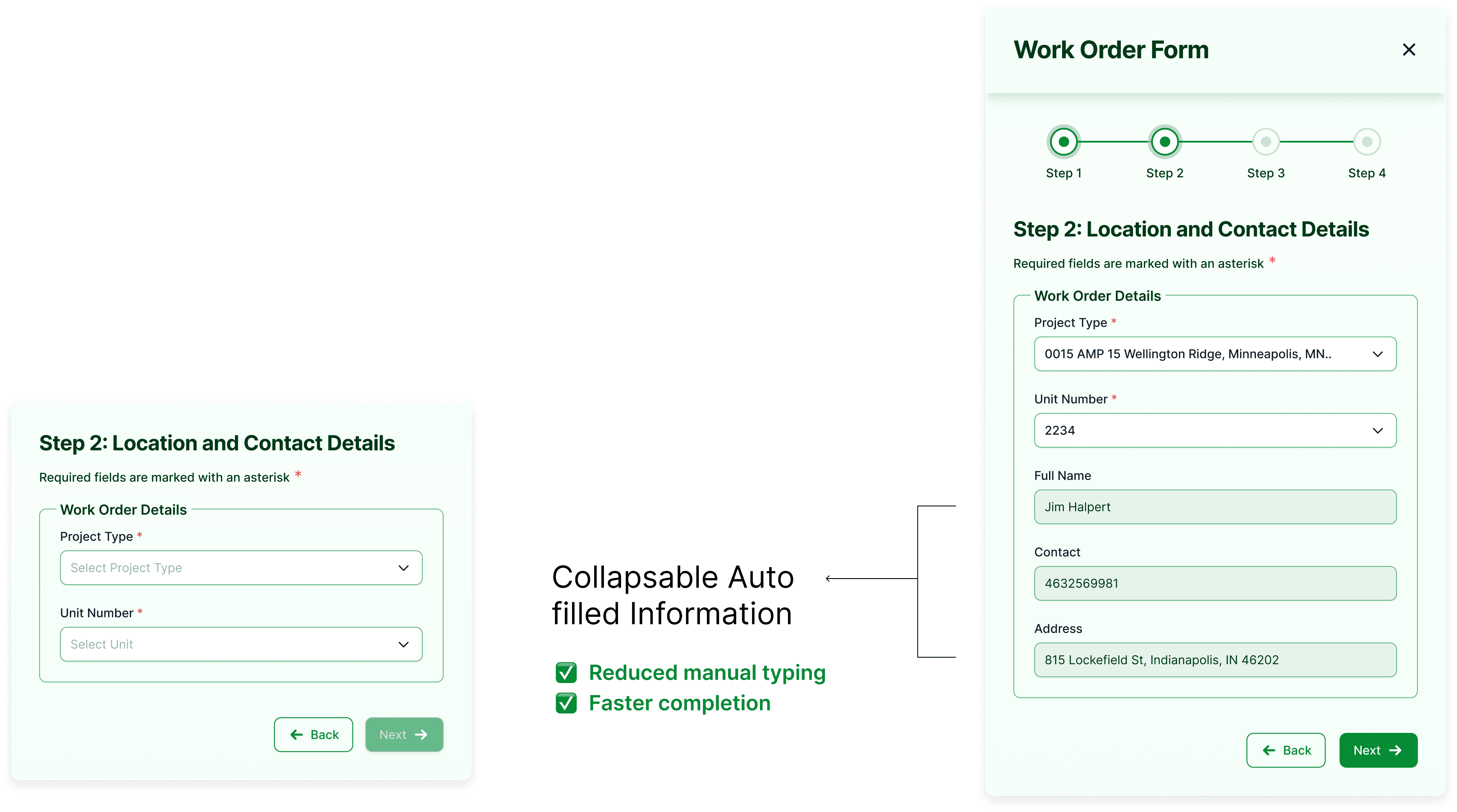
Clarifying with engineering which data the system could pull automatically.
The second half of the problem: staff couldn't see status
I also proposed bringing the work order flow into the web portal, giving housing authority staff status visibility they didn't have before. That was a direct answer to what staff had described in interviews: no way to check progress without calling the worker directly.
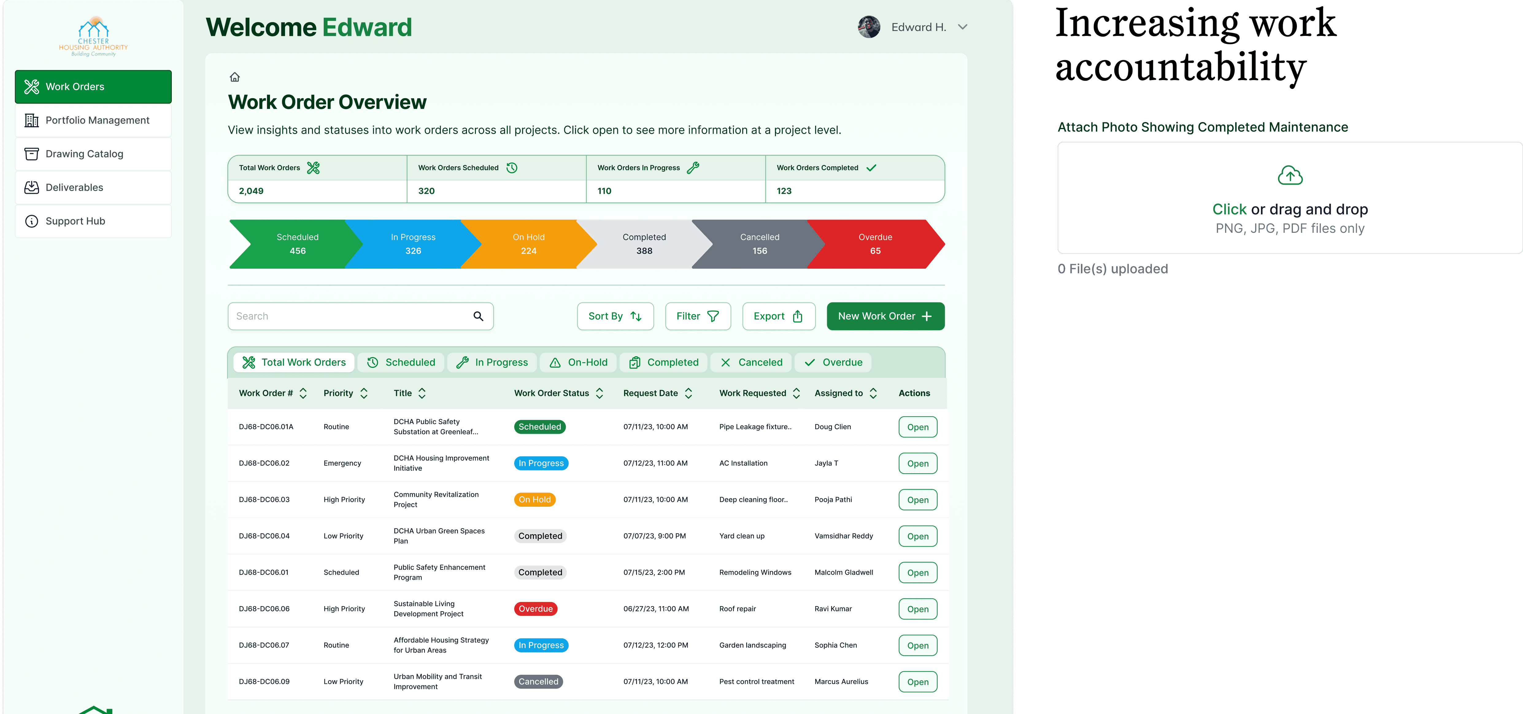
Context surfaced before staff create a new work order.
Pressure-testing it with engineering
These working sessions are where design decisions got stress-tested: what could be auto-populated, what validation the system required, and what was realistic to ship. This conversation directly shaped which fields could be removed versus which had to stay manual.
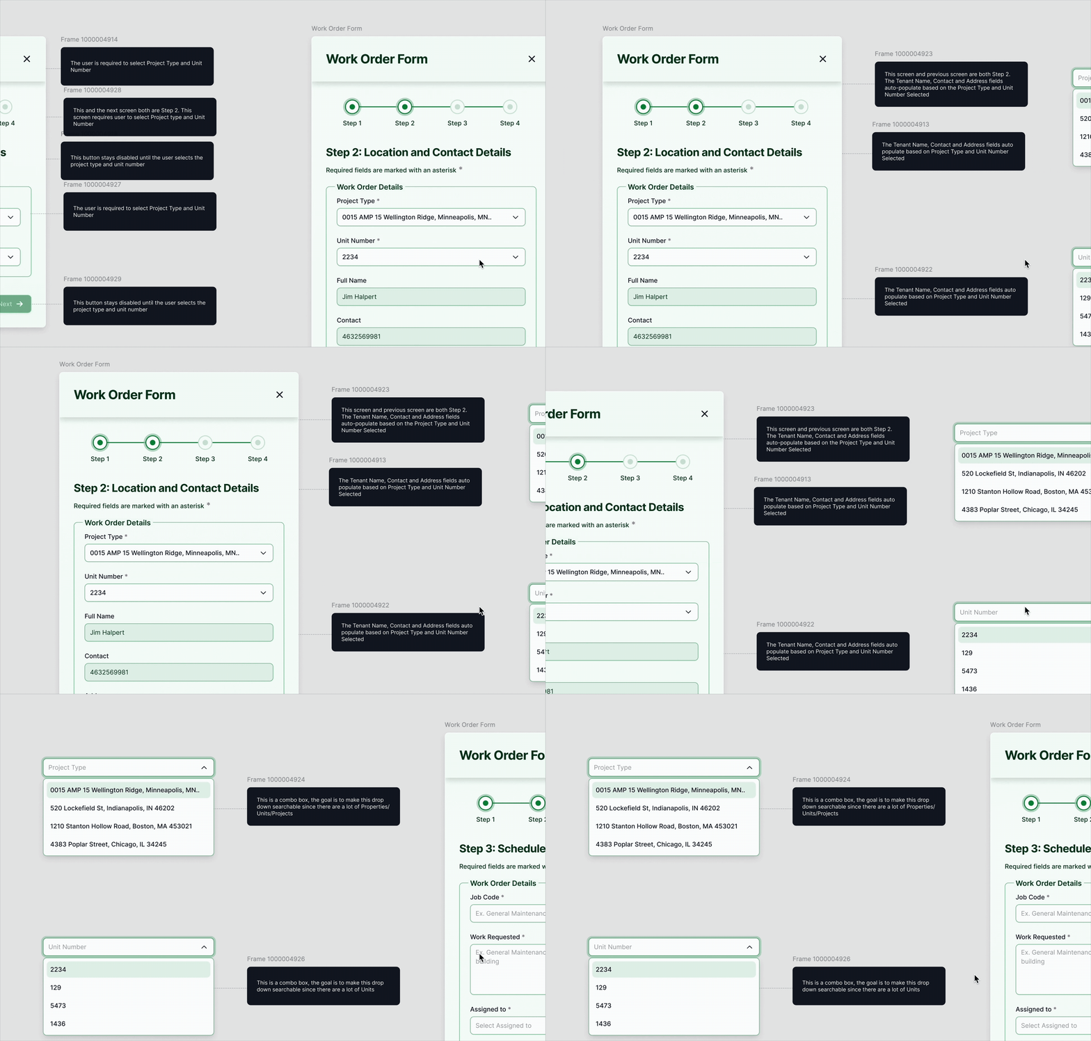
A working session from design–engineering collaboration.
Visual QA hand-off
Redlines for the build: spacing, sizing, and states specified so nothing was left to interpretation.
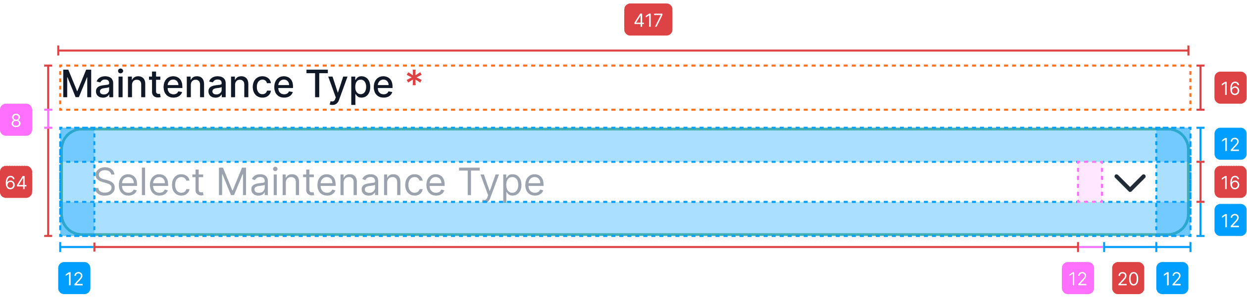
WCAG accessibility check
Every color in the form's palette checked against WCAG AA contrast standards before hand-off.
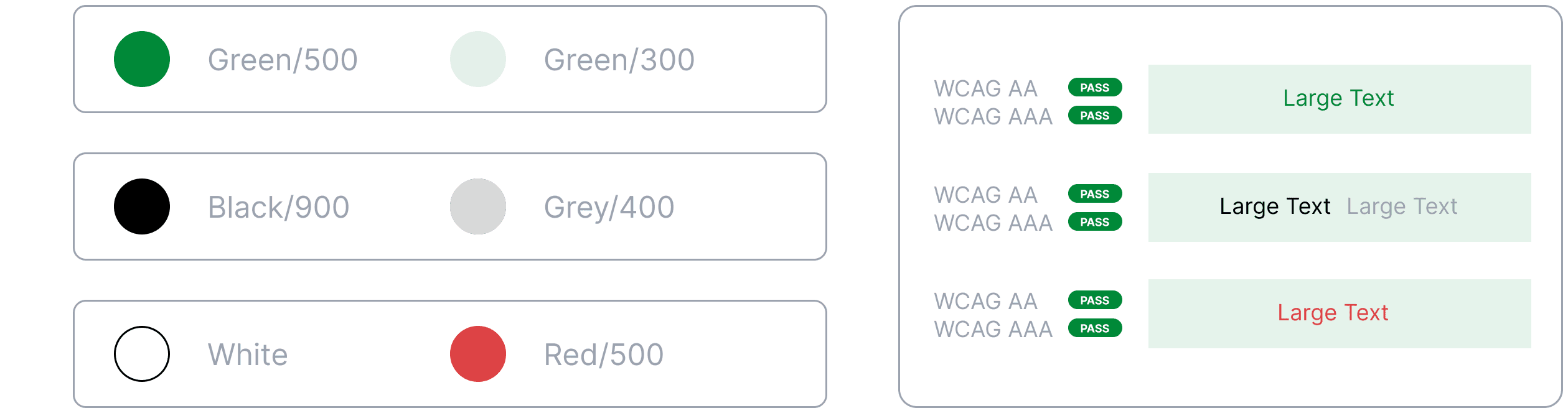
The flow was rebuilt and the fields trimmed. The visuals were verified against WCAG contrast standards, and the redesigned form was ready to ship inside the two-week window.
Impact
The shipped form asked workers a third fewer questions per work order, and the flow moved into the web portal, where staff could finally check a work order's status without a phone call.
For workers, that meant less time hunched over a form on a job site and more time actually fixing what was broken. My contract ended before full rollout, but the team had already begun shipping the first pieces of the redesigned flow.
For housing authorities, it meant fewer delays and more completed work orders, with real visibility into status instead of a black box.
What I'd measure
These are targets for what I'd track after rollout, not measured results.
~25% faster
Form completion time
Did fewer decisions per screen translate into faster orders?
~30% fewer
Orders re-opened
Work orders re-opened due to missing or incorrect data.
~40% fewer
Status-visibility tickets
Support tickets tied to "where is my work order?"
Reflection
I kept generating directions because more options felt like due diligence. On a two-week sprint, though, every direction I explored was time not spent deepening the one that mattered. The feedback was blunt: two well-developed versions beat five partial ones. Now "how many directions" is a decision I make on day one of a sprint, not something that grows because I haven't committed yet.
